Individual final essey

During the master in Marketing & Brand Management I had the opportunity to study branding and graphic design through the course of Branding design. At the beginning of the course I was not sure what to expect and I did not know of how practical it would have been. One thing that mostly concerned me was the use of graphic programs such as Photoshop, since I had very limited experience with such software. Nevertheless, I found the whole course challenging and extremely useful because it allowed me to develop a set of critical skills that are highly required in the job market.

The course covered numerous topics, but in every lecture we started by learning the basic theory and principles of each subject. This really helped me to have a guidance and a ground to start from in doing each exercise and project. In addition, this made me understand that even though creativity plays a big role in this discipline, the development of a project is not solely an instinctive and creative process. Actually, everything need to be thought through and even minor decisions can make the difference when communicating ideas through visual images and visuals graphics.

In one of our first lectures I learnt the basic elements and principles of design, this helped me to keep a theoretical a framework in mind. During the whole course and the development of projects, I could always go back to this guidelines to find inspiration or check if what I was doing made sense and if I was following the right rationale throughout the creative process. I remember that the exercise we did in the lecture (describing common objects with proper design terminology) helped me to understand and absorb the correct language to use with designers and I believe that in the future it will help me to communicate effectively with them.

As the course went through, we focused on the different languages and meanings of specific design features. One of these was typography, I found surprising the strong impact that the choice of a typeface has in conveying a coherent message. In addition I found it immediately applicable to brand management, since, to develop and communicate effectively strong and coherent brands the choice of the typeface has to be thought through. The impact of typeface in branding is relevant because it potentially affects the brand name, logo, packaging and all types of communications. Dafont (no date) is a very useful website which provides numerous varieties of fonts that helped me to find some inspiration and to expand my knowledge of fonts. A further topic was the meaning and impact of colours in design, which I found very interesting due to its multiple applications. Once again, this topic was directly applicable to the core topic of my master, brands. In fact, colour can highlight certain elements, convey specific meanings and catch attention. Thus, it is concretely applicable when deciding on a brand’s colours, packaging and communication in order to apply the palette effectively. Understanding Graphics (2015) is a very interesting and useful website on graphic design and much more, which has several sections dedicated to multiple topics related to design where I found a section on the different functions of colour.

However the topic I found mostly interesting and useful for the job position I aim to achieve, brand manager, are the ones discussed in the lectures dedicated to the Adobe Creative Suite programs, namely Illustrator, InDesign and Photoshop. Before this course I did not really know how to use them and they seemed extremely difficult to understand. Nevertheless, lectures helped me to understand the underlying logic of these software, but most of all, having to apply them for the course assignments made the difference.

The first assignment required to develop a logo for a factitious product and to create its brand guidelines. In order to create the logo I had to use was Illustrator. I found it particularly challenging and I had to work a lot to achieve the result that I wanted. I spent several hours in front of the screen and finding solutions to issues during the process was almost never immediate or easy, even with the help of video tutorials. In a way, I faced the same process when I had to design the guidelines with InDesign, not being familiar with the program made things more difficult. One of the main obstacles with InDesign was deciding where to position text sections and images. This process took me some time and I had to change the display of the elements more than once to make them look harmonious. For the group assignment, we had to develop an advertising including three images for the campaign. To complete this task we had to apply the final touches to the images with Photoshop. Using Photoshop has been challenging as well, but in a way I found the program more intuitive in its use and being able to count on my group members to complete the task made things easier, because each of us could contribute to the assignment with his or her skills. 

However, having to overcome problems and issues by myself made me learn the basics of the program and how to manage the tools. I believe that gaining this skills will be extremely useful firstly whilst searching for a job, since such skills are highly valued in marketing positions and I will be able to show the material I produced and what I can practically do. In addition, through this course I learnt what is possible to do with this programs and how to effectively communicate with designers and photographers to achieve the best results.

Each project, has been a discovery, I had to learn how to approach creative assignments, how to use the programs and develop a critical eye for visuals and concepts I never had to think about before. Hence, I am confident that this experience will be valuable to move my next steps as a marketing professional.


Individual final essey

Photoshop and photography an happy ending

The topic of one of our last branding design lectures was photography. I didn’t really know too much about it or at least about how to professionally take photos… and I usually am one of those people who places their fingers on the camera’s lenses every time they have to take a picture… So I was really looking forward to learn something about photography and understand the basic principles and rules to run a proper photoshoot.

Firstly we taleked about the basic principles of light and shadows in photography and we learnt a quick technique to add more light or more shadows to a picture by simply using a white paper sheet to reflect and amplify the light. Light actually has a very strong impact in the resulting effect of the picture and a change in the balance of light and shadows can make the photo much more dramatic.

DSC02825

We than had 1 hour to shoot 4 images starting from 4 very different briefs. This really put us into action since we had a very small amount of time to come up with the ideas and to actually shoot the pictures. In addition, since the briefs were very different, for some photos we had precise steps we could follow, whereas for others only the broad concept was explained and we had more freedom to shoot the pictures.

Learning how to manage a brief and how to understand what kind of result the client wants was really interesting and useful. I believe that this experience will help me to better understand how to properly write a brief myself in order to obtain the result I am looking for, and to understand how to communicate effectively with advertising agencies and photographers.

Here is a blog about the basics of photography which helped me to understand the basic principles of photography.

In the further sessions of the course we learned how to modify images with Photoshop. Similarly to Illustrator and InDesign, the first approach was not easy and it took me a while to play around with it and understand how  to  properly use the basic tools. However I found it extremely useful when it came to modify and fix images.

For our last group assignment we had to reposition a brand and develop an advertising campaign….this also included directing a photoshoot! The photoshoot experience has been extremely fun and exciting and tought me a lot. Having to take photos yourself and in a professional way makes you understand how the smallest change in the light or angle of the photo makes a huge difference. And how having to direct someone to get the right pose or look can be difficult and take a lot of time. It was also interesting to see how images might look very different from the camera and the laptop screen till the very print out.

We had to re take a photo because even though it seemed good on camera once we tried to modified with photoshop to get the effect we wanted it just did not look right. A further challenge was the actualization of our idea for the campaign…our pictures portraid female models and we wanted to integrate in the pictures some lion features…to make the model look fierce and strong as a lion. This took us a lot of time, in order to make it look as realistic as possible, but we made it and this is the final result of our campaign (we targeted Lion chocolate bar to women in their twenties).

11080739_927862533902116_2995209790748468416_o 11080776_927859743902395_5473728261837511846_o 11080821_927861253902244_2859649311657256880_o

Developing  this campaign taught me how important it is to have at lease 2 or 3 option when presenting and working on a creative project and really made me learn a lot on how and actual campaign is created and shoot.

I think that this experience will be very useful for me and I think that with the skills I gained with Photoshop I will create a small portfolio (including the campaign) which I will present in job interviews to show what I can practically do with such programs.

In addition, directing the photoshoot and modifying the images made me understand what are the challenges and dynamics of realising a campaign and I’m sure this will help me to communicate more effectively with photographers and graphic designers.

Finally this is a tutorial which really helped us to work on the images and obtain the realistic look we were looking for.

Hope it can be useful for you too!

Photoshop and photography an happy ending

Adobewhaaaaaat????!

That’s it….the time eventually came….I mean it, it is happening! No not the zombie apocalypse and no.. not even the winter…nerdy tv series addicted will get the references.

No, I am talking about the actual moment when I had to use programs like Illustrator and InDesign. And I don’t mean just play with them… I mean I had to actually learn how to use them to develope a Brand Guideline. So, the guidelines are almost done, but the way to get there has been hard! However, in this case I can confirm that the best way to learn something is doing it. After several hours in front of the screen, several emotional-almost-nervous breakdowns, and several Google and Youtube researches, I actually started to understand how the programs work and how to use the main commands. Do I even have to tell you how useful this is?! Well first of all I started to develop some good basic skills with the program that are required in several job positions related to marketing. I was also able to develop actual material to show at job interviews which includes the brand guidelines and a logo design. Considering that I will start the research of a job very soon, developing these skills is extremely practically useful and often required or appreciated for several job positions related to marketing. In addition I think I will start to use InDesign very soon to update and improve my CV, in order to make it more appealing and interesting. Even though the process to learn how to use these programs was painful, I’m not going to lie..I think the effort was worthing it. Now I have some skills that differentiate me from other marketing position candidates and that enable me to  produce portfolio material. This is the logo I developed in Illustartor for my brand Best Brushes,which is specialized in the production of personalised premium quality paint brushes.

DEF BRUSH colour RED-page-001

So during this learning process I found some very helpful tutorials, manuals and  websites to which I will surely go back in the future:

– For Illustrator CS6:

Adobe Illustrator CS6 Manual 

– For a more general and basic guide on how to start with Illustrator:

Makeuseof

-Youtube channel video tutorials:

Terry White

– For InDesign CS6:

InDesign CS6 Manual

– A platform to get started with the program with video tutorials

I hope these links will be as helpful for you as they were for me!

Adobewhaaaaaat????!

Colours

In one of my last lectures of Branding Design we covered the topic of colours. I have to admit that I still go crazy every time I walk by an art tools shop or the arts and craft section of a store and see all the beautiful types of colours that they have…from the crayons to the spray bottles, watercolours and paint….my inner child screams with joy! However, colour can also be a serious matter, especially if we consider the research and studies conducted on this topic through the centuries. In my class we started with the basics and we considered the complementary colours and the colour wheel.

color-wheel-300(http://www.tigercolor.com/color-lab/color-theory/color-theory-intro.htm)

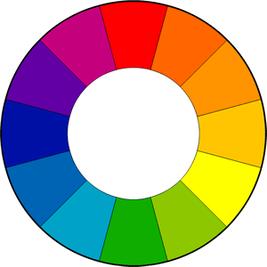
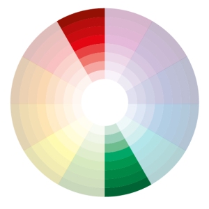
The colour wheel was developed by Isaac Newton in 1666 and since then artists and scientists developed several variations and studies based on it. Basically through the colour wheel we can see the spectrum of colours that can be obtained with different combinations of the primary colours: blue, red and yellow. What we obtain, then are the secondary colours: orange, purple and green. A rule of the colour wheel states that the colours that are opposite to each other on the wheel (complementary colours) create a vibrant combination that should be managed carefully in order to don’t result irritating, for example green and red.

07

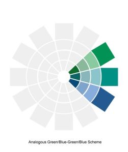
Wherease, analogue colours (the ones close to each other in the colour wheel) used together are more harmonious and pleasent to the eye, for instance blue and green.

267bb8ec70fa176960a2c60c18b382c7

If we think about design, brands and marketing colours have a derminant role in communicating emotions, feelings and ideas. Plus, it has to be kept in mind that colours’ meaning can be very complex and change across different countries and cultures. One of the most known examples would be for colour white, which in western cultures is associated with purity and cleanliness and peace. Whearese in eastern countries is associate with sadness, death and mourning.

_72367850_723660602-beach-wedding-in-white

(http://www.bbc.co.uk/news/world-asia-india-25790752) (http://forum.thefreedictionary.com/postst55902_church-wedding-vs–white-wedding.aspx)

I think that in order to pursue a carrier in either marketing, branding, advertising or marketing, like I do, it is very important to develop a good knowledge and eye for colours. Especially about the different meaning of colours across the world, in order to use them in the most effective and appropriate way. For instance, I can imagine myself having to decide on what colours to include in a company’s blog or what type of colours to use in a product package to coherently convey the product’s and brand’s values and identity.

To get some tips, Smashing Magazine here  provides some useful basic information about colours’ meaning and their application in design. Another useful website to keep updated about the latest colours and news related to them is the Pantone website where you can find a great amount of information, products and services for colours. To conclude, colourlovers.com is a great source for everything related to branding, colours, design and much more! Here is a summary of their articles and  infographics specifically related to colours.

Enjoy!

Colours

TYPOGRAPHY

As my Branding design course goes on at University, I learn more and more about this intriguing world. Lately I have been thinking about typography…we had a lecture about it and we deeply analysed the features and components of fonts. The earliest memory related to typography that I have, sees an eleven years old me trying to write down a greeting letter in a personalised handmade font for my best friend. Sure I was enthusiast about the idea of creating something more special and personal like a font, but at the time the results were questionable….

its-something

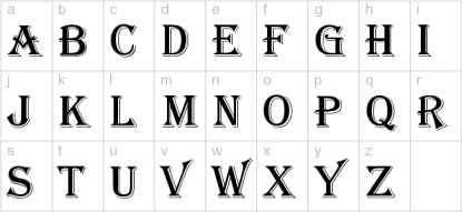
If I remember correctly, the font I tried to recreate was quite gothic and similar to the Algerian font provided in Word and that looks like this:

Algerian-lower

(https://forum.lowyat.net/topic/2583729/all)

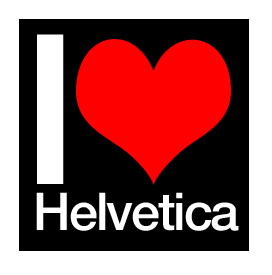
However growing up I did not cultivate my knowledge about typography and the main information I absorbed came from friends that studied design or architecture…therefore, the information I collected sounded more or less like this:

I_Love_Helvetica_by_mattslade(https://forum.lowyat.net/topic/2583729/all)

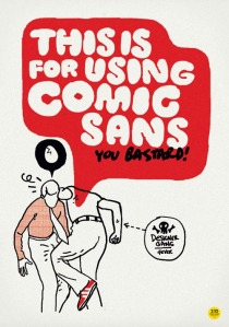
and like this….

Comic_Sans

(http://www.jazjaz.net/2010/08/the-punishment-for-using-comic-sans.html)

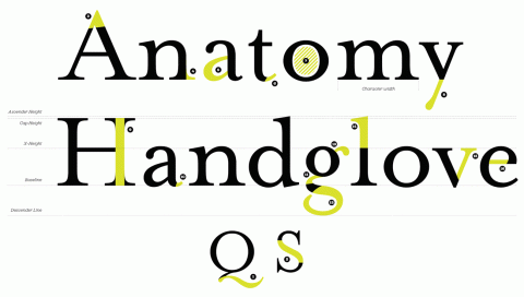
However, going back to my lecture on typography…I learnt a lot about how complex a font actually is and how its characteristics go beyond its style and size. The actual composition of typography is quite complex and this is a comprehensive image of its components:

type

Understanding the different elements that create a typeface led us to also understand ho different typefaces communicate different things and change the tone of how we read a sentence in our mind. This is a practile example, try and read this sentence and see how you process each word in your mind:

visuallanguage

Isn’t it impressive?! The way we interpret words so differently just according on how they are visually presented! This made me immediately think about one of my goals in the near future…create a personal website in order to increase my employability and to share on a more personal platform ideas, aspirations, dreams and my interest. I think that what I just learnt about fonts will enable me to communicate more effectively by choosing the right and more effective fontin accordance with what I want to communicate.

During my internship I used a very good website, which provides a huge amount of different fonts divided by categories and styles, the webdite is dafont.com . I think that this website is very useful, to either just browse different types of typefaces and get some inspiration or to simply download the fonts that you may need. I also found two very interesting blogs related to typography: Ilovetypography  and typography.com. Both blogs give a lot of tips and interesting information, curiosities and news about fonts, check it out!

TYPOGRAPHY

Branding Design!!! Let’s get it started!

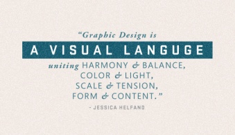
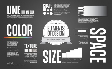
On the 23rd of January I had my first lecture of Branding Design. I never really had the opportunity of studing graphic design, eventhough I always promised myself I would have imposed to myself to learn more about it and to teach myself how to use the designing programs…but then procrastination kicked in. Therefore, I was very excited to start this course and to actually start and get some insight in this discipline. We beginned by understandi the “language” of design. And we looked at some specific terminoligy and concepts used by designers to develop and present their work. We, then, had a look and commented on the basic elements and features of graphic design, try to understand the rationale beneath it and how to think and interpret graphic design.

789810863_orig


(http://lthscomputerart2.weebly.com/the-elements–principles-of-graphic-design.html)

What I found extremely useful was the exercise we did afterwards. In pairs we had to try and describe a common object to each other using the terminoligy and concepts of design elements just lernt. This really helped me to better understand the theory by relateing it with something tangible and common such as a pen or a wallet. I believe that learning how to properly communicate with designers, is an extremely relevant skill, especially if I consider my future goal of working in marketing. Being able to communicate precisely what we want to achieve with a design, logo or webpage helps both marketers and designer to effectively achive great results and in a more efficent and time saving way. In addition, for a marketer, to understand what can actually be done with design programs becomes an advantage. Firstly, because it opens up the imaginative options that can be used for a project and secondly, because it is fundamental to understand what can be done by designers also in terms of time and resources. Therefore, I think  that I will keep reading and try to be up to date with graphic design concepts, information and news in order to develop my skills in this field and improve my employability skills.

This lecture and exercise, also made me reflect on how we visually process images and text and on how different cultures might process them differently. It also made me think about the impact of different languages on how we visualize and process visual information according to their position on the page. For instance, a japanese person will automatically process text and images from right to left, whereas we do automatically process them from left to right. Therefore, this made me think about the complexity of communicating with a broad amount of different people just through graphic design. Communicating with broad audiences from different cultures can be very difficult because they might interprer images and concepts in completely different ways. Therefore, developing a design which can be interpret in the same way by very different people becomes an important challenge. Here is a useful link on Accidental Meanining in Graphic Design and how to properly convey information through your design.

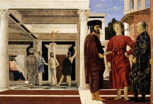
During the last part of the lecture we were taught a simple technique that allows us to draw in either a One Point Perspective or in a Two Point Perspective. This really made me think about what I have previously learnt on perspective in high-school and particularly about the artist and mathematician Piero della Francesca, who rigorously applied the rules of prospect theory in the painting of his masterpieces. This is one of his most famous paintings titled “La flagellazione di Cristo” which in English means “The flagellation of Christ” where the artist appies a One Point Perspective.

piero-flagellazione ( http://damianofranco.blogspot.co.uk/2010/03/herr-unser-herrscher-passione-secondo.html)

Thankfully, we will not have to be able to apply Perspective like this artist in order to pay bills! However, I do believe that this two simple techniques can be very useful to understand how to visually distribute images and visual information, and this can be applied on daily bases in marketing communication through the development and planning of visual contents and advertising!

lorry-advertising-thumb

Well enought for today, see you at the next post!

Branding Design!!! Let’s get it started!